Welcome to font psychology or the science of typography – how fonts affect cognition & behavior of people.
Designers swear by the importance of fonts. They often see what most people overlook. At the superficial level, it could feel like fonts are about the beauty of the written word. But, as designers say, ‘It reflects the character of writers and their written word. It is deeper than looks and can make or break a word and your experience.’ This is their way of saying ‘Font psychology is important.’ This post will be my way (or the
Let us take a scientific look at the role fonts & typography play in learning, memory, emotion, behavior, attention, creativity, reading, and thinking.
In this short post, I’ll summarize the research and then draw practical insights for you to use in your life – professional or otherwise.
If you are hoping to find what psychological sciences say about fonts, you’ve come to the right place.
Incoming research insights.
- Use Font Psychology Research To Choose Your Fonts
-
Hack your brain with fonts using these font psychology insights
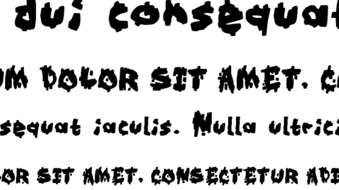
- 1. Font size, memory, and confidence in learning
- 2. Reading fluency and font difficulty
- 3. Font difficulty and distractibility
- 4. Reading speed and typeface
- 5. Fonts, emotion, and personality
- 6. The shape of ‘You’ (or any other word) and proofreading
- 7. Emotion, font aesthetics, and creative thought
- 8. Comprehension and caps-lock (aka shouting)
- 9. Letter spacing and learning
- 10. Font size and reading comprehension
- 11. Dyslexia, readability, and the designer’s folly
- Sources
Use Font Psychology Research To Choose Your Fonts
Note: This is almost like a speedy review of the literature. I’ve cited over 15 studies to draw insights that represent the general findings across the board.
The area of font psychology is pretty thin. These are, in my opinion, research studies & insights that paint an accurate picture of the state of the art.
What is typography?
Typography is the collective features that make up the style of printed material. This includes:
- Font style/Typeface (Sans-Serif, Serif, Monospace, etc.)
- Font size
- Letter spacing
- Letter thickness
There are other features that matter too. Such as the background color, negative space, density of content, average size of words, reading audience, etc. Typography sets the tone and the mood for the content.
What does psychology have to do with typography?
Psychology looks at a number of things about the human. Here is an article that speaks about what psychology has to do with, um, a lot of things. Information is conveyed through a number of channels – spoken words, raw data received through sensory organs, interpreted data like words, actions, etc.
Writing is a particularly dominant representation and carrier of information. It is stable, more or less permanent, verifiable, and can be easily accessed.
The processing of information is a huge topic of research in psychology. That brings us to typography, which is an inherent characteristic of the written word which represents information. Font psychology is all about the interaction between mental & neural processes, the environment which contains the typography, the typography, and the
Cognitive psychologists are particularly interested in this area because they can ask questions like- What is the effect of fonts on memory? How the speed of reading a book is affected by fonts? Can fonts mitigate the effects of dyslexia? Simply put, the way people feel, think, and respond to fonts is important to psychologists. In fact, it is important to marketing and salespeople as well. Fonts can also represent a brand. They may or may not go with a brand and thus, make things awkward or smooth.
Take, for example, the internet. Different websites have unique typographies. Website owners think about what their audiences will like. They will consider if the font serves the purpose of the website’s content – plain information, or product sales, or conspiracy theories. Through these thoughts, there are standards and common opinions – Calibri is safe, Times new roman is newspaper-like, comic sans sucks (No, it doesn’t), cursive is old parchment scroll content, etc.
At the center of this is – human behavior or Font Psychology.
We know humans can relate seemingly random visual shapes to certain words and ideas. This is demonstrated by the Kiki-Bouba effect. Click here to find out more about how humans abstract and process deeply ingrained information.
This will be your scientific guide to choose the right fonts.
Hack your brain with fonts using these font psychology insights
The research summary section outlines the study.
The insights are actionable tips for you.
1. Font size, memory, and confidence in learning
Research summary: In one study, researchers found that all participants predicted higher recall for large font items rather than small font items, regardless of font style, and demonstrated higher recall for bold than regular or italic styles. Younger adults obtained higher recall than older adults and their judgments of learning were also given higher ratings (Price, McElroy, & Martin, 2016).
Insights: Memory for bold content is higher than normal or italic. Larger fonts also help memory. You can structure your documents/webpages/banners/posters to be memorable by choosing the right font features. Younger people remembered better and also felt that their learning was better. In extended education, fonts can be used to diminish the feeling of poor learning.
2. Reading fluency and font difficulty
Research summary: Formatting a document involves strategic usage of features such as bold, italic, and underlining to make a document pleasing, organized, and easy to read. An experiment on the difficulty of reading observed that using Information written in fonts that are harder to read was remembered better than information written in fonts that are easier to read (Diemand-Yauman, Oppenheimer, & Vaughan, 2011; Price et al., 2016).
Insights: This may be one of the best insights. Harder-to-read fonts promote the memory of that content. If you make your content too easy to read, you might not remember well enough. Buy books that have hard to read fonts for school and colleges. *_- Buy books that are good. Change the fonts of your digital notes to something hard to read instead.
3. Font difficulty and distractibility
Research summary: Another study found that hard-to-read fonts shielded the reader against background noise whereas background noise significantly impaired accuracy and comprehension of fictional biological information when presented in an easy-to-read font (Halin, 2016).
Insights: Another benefit of hard to read fonts is that you will be less distracted in noisy environments. This is because you need more mental resources to absorb the information from harder to read fonts and that makes it difficult for your attention waver. In short, if you are easily distracted, fonts that are hard to read will help you focus.
4. Reading speed and typeface
Research summary: A study on perceptual fluency as a function of serif features in a font shows that the absence of serifs increased the speed of reading online scientific abstracts (Kaspar, Wehlitz, von Knobelsdorff, Wulf, & von Saldern, 2015). Serif fonts also appear to aid recall; better than sans-serif fonts (Gasser, M., Boeke, J., Haffernan, M., & Tan, R., 2005).
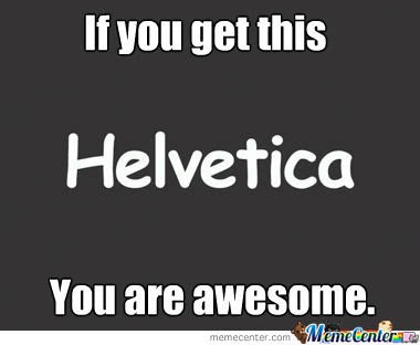
Insights: People may like Helvetica, but if you want people to spend more time on a document, reduce perceptual fluency. Use Serif fonts to increase the time spent reading. If you want to read a lot in a short time, make the font a sans-serif font.
5. Fonts, emotion, and personality
Research summary: Apart from the effect of typography on cognitive outcomes and perception, researchers have observed that humans can ascribe emotional and anthropomorphic qualities to typefaces (Juni & Gross, 2008); (Caldwell, 2013).
Insights: People find satirical content as funnier and angrier if written in Times New Roman. In comparison, Arial is not that funny. The Japanese find Serif fonts as elegant, classical, staid, and sleek. Whereas, they find narrow fonts as modern and positive. Younger people prefer serif fonts and the older prefer sans-serif. As perception is partially culture-dependent, this probably cannot be generalized.
6. The shape of ‘You’ (or any other word) and proofreading
Research summary: Additional evidence on perception comes from changing the shape of words by deleting or mutilating the letters within. Researchers found that proofreading errors were easier to spot when the shape (visual structure) of words was preserved by substituting letters as compared with deleting letters (Monk & Hulme, 1983).
Insights: Missing letters are harder to spot while proofreading. Mistyped similar letters like ‘q’ and ‘g’ or ‘d’ and ‘b’ are easier to spot.
7. Emotion, font aesthetics, and creative thought
Research summary: Reading content is one of the most apparent activities one performs on a computer. One antecedent of reading is creative cognition (thought-provoking articles, summaries, trends analyses, story writing, ideation, etc.). One study found that creative cognition improves as well as reduces activation of muscles underlying the frowning response when text is typographically optimized for aesthetic appeal (Larson, Hazlett, Chaparro, & Picard, 2007). This shows that there may be a deeper level of biological effects elicited by fonts.
Insights: If you want your readers to think creatively about your content, make it look pretty. This prettiness also reduces a very carnal precursor to frowning. So you are less likely to be frowning and more likely to think if the content is pretty.
8. Comprehension and caps-lock (aka shouting)
Research summary: Not many studies have focused on neural mechanisms underlying cognitive outcomes contingent on typography. One study suggested that uppercase text interfered with reading comprehension due to increased orthographic processing which, ultimately, strained the neural resources available for higher-level processing involved in comprehension (Choi et al., 2018).
Insights: All-caps is bad, don’t overdo it (read: almost always, avoid). Your brain will unnecessarily need more mental resources to decipher the content and thus compromise higher-level processing. Comprehension of content will drop with All-caps.
9. Letter spacing and learning
Research summary: Research showed that increased spacing between letters improved fluency and minimized learning errors, however, event-related potentials were not affected by spacing in the first second of processing (Sacchi, Mirchin, & Laszlo, 2018). Such findings suggest that data is insufficient to model and clearly predict the effects of typography on memory and related cognitive processes.
Insights: Readability and accuracy of learning improve when there is sufficient negative space between letters. Use fonts where the letters don’t appear to hug each other.
10. Font size and reading comprehension
Research summary: A study on the effects of typography on reading comprehension done on 2nd and 5th graders found mixed results. 5th graders demonstrated higher comprehension with a decrease in font size while second graders demonstrated poorer comprehension with a decrease in font size (Katzir, Hershko, & Halamish, 2013). This finding suggests that developmental factors may play a key role in perceiving typographic features that affect learning.
Insight: Bigger is not always better. That changes with age. In designing books or tests for 2nd graders, increase the font size (>14). For 5th graders, decrease the font size (<14). That is if you want the kids to have better comprehension.
11. Dyslexia, readability, and the designer’s folly
Research summary: A study presented 12 unique fonts to dyslexic people and found that the serif, monospaced, and Roman properties of fonts improved readability for them. On the contrary, italics and slants increased the eye fixation time for words. The researchers also used a font that was designed specifically for dyslexic people (OpenDyslexic) and found that it performed poorly (Rello and Baeza-Yates 2013).
Help me run this site with a donation :)

Insights: Eyes move in saccades and jump between word sections, not word after word. Increased eye fixation reduces readability. For dyslexic people, readability improves when Helvetica, Courier, Arial, Verdana, and Computer Modern Unicode are used. A key insight is that a popular designer font for dyslexic people surprisingly (not-so?) failed to perform. Read the last post-script.
The literature suggests that perceptual features & the cognitive load (how heavy the information is) of fonts contribute to cognitive outcomes such as recognition and recall.
While evidence suggests that typography does, in fact, affect memory, perception, thought, and emotion, there is a scarcity of replication studies. The state-of-the-art is lacking in density and research findings do not point to a clear direction. Be careful in using these insights as more information will be generated with more studies.
Bonus finding: Behold. Comic sans is good for memory[1]. You are likely to remember content written in comic sans better than content written in Bodoni and Arial. They asked the participants to read about a fictional alien creature (how exciting). This gives some insight into how we would remember biological information. A lot of it is alien to us before reading about it. Wouldn’t it be a beautiful world if all detail-oriented textbooks are printed in Comic Sans?
Now you know what the psychological sciences say about the effect and value of typefaces, fonts, and other related features. You can make educated decisions about your font choice. It’s time to hack your brain or the reader’s brain by using fonts strategically.
If you really do choose to use these psychological hacking mechanisms, do leave comments on what the outcome was. Would love to hear how you used these insights!
Font psychology or the science of typography is still a very new field of research. I’m glad it has become a thrust area for many researchers and designers. Isn’t it obvious that the applications of font psychology are wide?
Special note: If you are a researcher, this is a great area to explore.
References
Caldwell, J. (2013). Japanese typeface personalities: Are typeface personalities consistent across culture? In IEEE International Professonal Communication 2013 Conference. https://doi.org/10.1109/ipcc.2013.6623890
Choi, S., Jang, K. E., Lee, Y., Song, H., Cha, H., Lee, H. J., … Chang, Y. (2018). Neural processing of lower- and upper-case text in second language learners of English: an fMRI study. Language, Cognition and Neuroscience, 33(2), 165–174.
Coane, J. H., Scott Jordan, J., & McBride, D. M. (2007). An Investigation of False Memory in a Short-Term Memory Task. PsycEXTRA Dataset. https://doi.org/10.1037/e537052012-356
Diemand-Yauman, C., Oppenheimer, D. M., & Vaughan, E. B. (2011). Fortune favors the bold (and the Italicized): effects of disfluency on educational outcomes. Cognition, 118(1), 111–115.
Gasser, M., Boeke, J., Haffernan, M., & Tan, R. (2005). The Influence of Font Type on Information Recall. North American Journal of Psychology, 7(2), 181–188.
Halin, N. (2016). Distracted While Reading? Changing to a Hard-to-Read Font Shields against the Effects of Environmental Noise and Speech on Text Memory. Frontiers in Psychology, 7, 1196.
Juni, S., & Gross, J. S. (2008). Emotional and persuasive perception of fonts. Perceptual and Motor Skills, 106(1), 35–42.
Kaspar, K., Wehlitz, T., von Knobelsdorff, S., Wulf, T., & von Saldern, M. A. O. (2015). A matter of font type: The effect of serifs on the evaluation of scientific abstracts. International Journal of Psychology: Journal International de Psychologie, 50(5), 372–378.
Katzir, T., Hershko, S., & Halamish, V. (2013). The Effect of Font Size on Reading Comprehension on Second and Fifth Grade Children: Bigger Is Not Always Better. PloS One, 8(9), e74061.
Larson, K., Hazlett, R. L., Chaparro, B. S., & Picard, R. W. (2007). Measuring the Aesthetics of Reading. In People and Computers XX — Engage (pp. 41–56).
Monk, A. F., & Hulme, C. (1983). Errors in proofreading: evidence for the use of word shape in word recognition. Memory & Cognition, 11(1), 16–23.
Munro, N., Baker, E., McGregor, K., Docking, K., & Arculi, J. (2012). Why Word Learning is not Fast. Frontiers in Psychology, 3, 41.
Pilotti, M., Chodorow, M., Agpawa, I., Krajniak, M., & Mahamane, S. (2012). Proofreading for Word Errors. Perceptual and Motor Skills, 114(2), 641–664.
Price, J., McElroy, K., & Martin, N. J. (2016). The role of font size and font style in younger and older adults’ predicted and actual recall performance. Neuropsychology, Development, and Cognition. Section B, Aging, Neuropsychology and Cognition, 23(3), 366–388.
Rello, L., & Baeza-Yates, R. (2013). Good fonts for dyslexia. In Proceedings of the 15th International ACM SIGACCESS Conference on Computers and Accessibility – ASSETS ’13. https://doi.org/10.1145/2513383.2513447
Sacchi, E., Mirchin, R., & Laszlo, S. (2018). An Event-Related Potential study of letter spacing during visual word recognition. Brain Research, 1684, 9–20.
von Hippel, W., & Hawkins, C. (1994). Stimulus exposure time and perceptual memory. Perception & Psychophysics, 56(5), 525–535.
P.S. I have used these insights in deciding the font for my website. Hope it is favorable. If it isn’t, do mention that in the comments!
P.P.S. It is easy for designers to get carried away with the font style based on how it impresses a client or get biased in their opinion instead of seeing how it performs. You could use these insights in finding out what font works for your content. Think about the function of the information you will use these fonts for and then decide.
Sources

Hey! Thank you for reading; hope you enjoyed the article. I run Cognition Today to paint a holistic picture of psychology. My content here is referenced and featured in NY Times, Forbes, CNET, Entrepreneur, Lifehacker, 10-15 books, academic courses, and research papers.
I’m a full-time psychology blogger, part-time Edtech and cyberpsychology consultant, guitar trainer, and also overtime impostor. I’ve studied at NIMHANS Bangalore (positive psychology), Savitribai Phule Pune University (clinical psychology), and IIM Ahmedabad (marketing psychology).
I’m based in Pune, India. Love sci-fi, horror media; Love rock, metal, synthwave, and pop music; can’t whistle; can play 2 guitars at a time.
Help me run this site with a donation :)


Thanks a lot. Very insightful and well summarized
Good website for my font experiment
Great to see there’s neuro research into typography happening.
Good work Aditya. Really appreciate your post here 🙂
Thank you! It is an interesting subject matter for psychology & neuroscience to study!
Wow! After all I got a web site from where I can really take helpful information regarding my study and
knowledge.
I really like your writing style, excellent info, thanks
for posting :D.
Thank you so much:) Keep visiting:)
Everyone loves it when people come together and share views.
Great blog, continue the good work!
Thank you so much for appreciating my effort:) Means a lot!