Airports have so many shops arranged in apparent chaos in the lounging areas after security checks. But it’s not chaos. The primary reason is – attract people to buy things when they are idle and waiting. But there are layers to this. Many airports have shops near boarding gates, closer to the farthest gates too. This is to incentivize purchases with the least amount of consumer effort. But there is another layer. People forget to buy gifts and souvenirs. Where are they placed? Quite close to the boarding gates. The entire arrangement tries to appeal to the thousands of people walking by.
Airports are a fascinating model of behavioral engineering and how to increase consumer purchases.
Not just airports. Most spaces are designed with psychological goals, particularly retail shops. It all comes down to maximizing purchases and improving consumer satisfaction by manipulating store atmospherics and layouts.
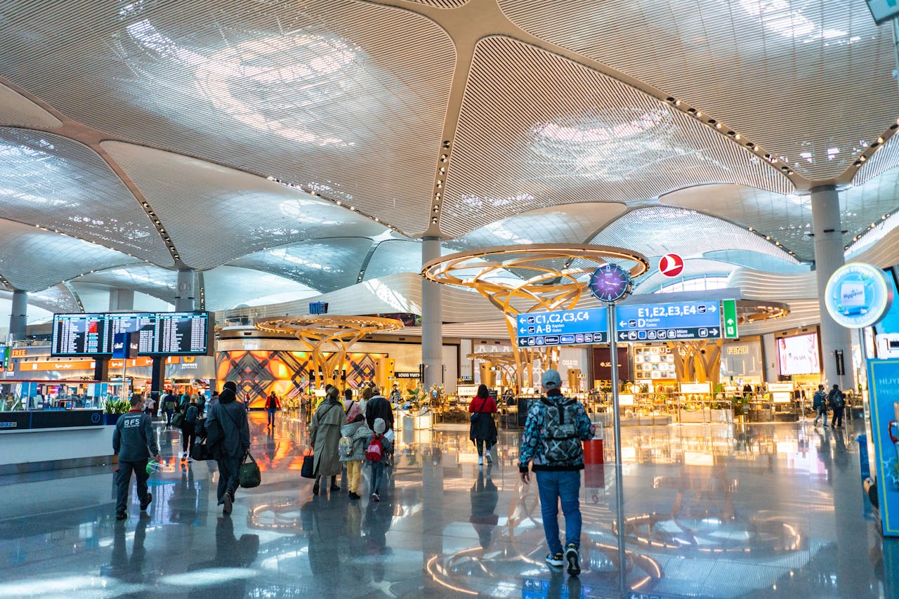
Istanbul International Airport. Notice how shops are in the field of view of random passersby.
Types of shoppers
Shoppers lie on a spectrum. I consider 4 types when it comes to layouts: Scanners, Planners, Buyers, and Spenders. The layout & design of a store can change the type of shopper from planners to buyers or scanners to spenders, for example.
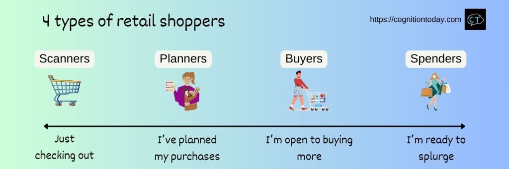
Scanners browse for products and deliberate over their decisions a lot. Planners know what they have to buy and purchase only that. Buyers have some items planned and are willing to buy more. Spenders are mostly unplanned shoppers, expensive or inexpensive.
The Gruen Effect
A highly capitalistic phenomenon emerges from the social ideas proposed by Victor Gruen – an Austrian architect from the 1950s[1]. He indirectly founded the “capitalistic space,” much against his social-cause-driven ideas. A capitalistic space is where people come to buy, often more than they have planned. He designed shopping malls to reduce the overheads of buying and transacting and also make it a city/civic center. But as a side effect, he noticed people spent time there, hung out, and purchased things without planning to. Industries saw an opportunity and the malls became a universal symbol of capitalism. This is the Gruen effect.
The Gruen effect now describes the phenomena where people make unplanned purchases in a shopping center and sometimes even forget why they came to shop, which leads them to indulge in the vast variety of products on display. The store’s layout and atmospherics fuel this phenomenon by becoming a continuous nudge to buy more. We’ll see how.
Store atmospherics
There’s a formal concept to introduce – store atmospherics. It’s a combination of ambient factors, design factors, and social factors. Essentially, it’s the technical aspect of a store’s “vibe”.
- Ambient factors include temperature, lighting, air quality, noise, indoor music, etc.
- Design factors include how shelves and sections are arranged, interior styling, what’s the store layout, how people walk through the store, what’s seen first, what’s seen last at checkout, etc.
- Social factors include who goes to buy there, whether couples or families buy there on a weekly basis, whether the store is for 1-time quick purchases, how much time people spend, do people make shopping a social experience like dates or family outings, etc.
All 3 come together and create a buying experience for consumers, and they influence how, when, and what they purchase. In their 2014 paper[2], Priyanka Singh and colleagues speak about “retail shoppability” as an outcome of store atmospherics which is a retail store’s ability to give consumers what they need and convert their needs into purchases. Higher retail shoppability means a store has what consumers need and they buy. Low retail shoppability means the store may have what consumers need but they don’t purchase, or consumers want things the store doesn’t have.
Store atmospherics are a multi-sensory experience with sound, visuals, temperature, smell, touch, and movement at the core. Taste is often neglected because stores typically do not serve food.
I’ll explain insights from Charles Spence’s research[3] on this multi-sensory experience with some additional mechanisms at play.
1. Visuals
Visuals are the most obvious, and rightly so, because our brain shows visual precedence – visual details are prioritized and processed deeply, and very quickly. Our initial judgments begin with visuals within the first 100 milliseconds.
The most influential component of a space is lighting and colors. Bright lights and color variety of products, and the color scheme of the store itself are designed to stimulate the consumer just enough that it creates a positive emotional state.
Diffused lights in a mall or store can annoy people. So the stimulation has to be optimal, not just high or low. Dull lighting in a big space can induce lethargy and lack of motivation. An excessive bright light can raise the overall temperature, strain eyes, and give a headache. Once there is optimal lighting, consumer’s motivation to spend time in the store and make purchases increases.
2. Sounds
Sounds are easiest to use. Look at malls playing classics and timeless pop songs. The idea behind that is to create social comfort. People relate to those songs, they relax to them, and the familiarity of those songs doesn’t distract from the slow, idle shopping experience. In larger malls, each store can have a brand “sound,” which is the type of music they play – instrumental classical music, pop songs, class rock, slow electronic, jazz, etc., These decisions are made by the store’s branding team to match the emotions they want their consumers to experience. For example, a jewelry store will play classical music that taps into the aspirations of a consumer by making them feel royal and regal. The music is designed to uplift the consumer’s self-image, which is a strong positive experience. This sort of self-image-lifting experience creates optimism, which in turn, influences risk-taking that translates into buying expensive things.
The tempo of music also sets the pace of the audience’s movement. Higher tempo music tends to increase arousal and people move along faster. The rough estimate is – under 70 bpm, people are slow, above 90 bpm, they are faster. Now, slower or faster matters. When people move slowly, they tend to stay in the store longer. When they move fast, they have an in-and-out approach which means a very measured to-do-list sort of approach to shopping. Slow movement increases the opportunity to think and deliberate over what to buy and indulge in the experience. Fast movement doesn’t leave room for much impulse buying.
But, this has a flip side too. Slow movement worsens other consumers’ experience because they have to obey the pace of other people at check-out counters and in aisles while exploring. They might simply want a slower or faster experience, but they have to follow the crowd’s pace. So the design fix for this is a highway aisle or highway space where people can move faster or slower. This is the reason why the grid store layout is so popular (next section).
The volume is typically at the ambient level – low enough to not distract, high enough to let it influence you without it grabbing attention. It is just above “feeling it” but below “drowning in it”.
But sound is not about music only. The most influential sound ends up being human chatter – people walking, sounds of people handling products (crackling of bags, picking up and placing items, etc.), conversations with occasional laughs, phone calls, and media played on phones. These are all background sounds that make up the atmosphere. So, even with silence, human chatter becomes a sort of background music that stimulates the consumer to stay active in the store (searching & moving) with social comfort (they feel they are one with the crowd and taps into their sense of belonging). In a way, human chatter is a disarming mechanism that reduces any sense of threat in a store, which creates a feeling of comfort & safety.
3. Smell
Of all the sensory elements, the most subconscious influence is smell. Smell has a bad connotation, so lets say scent. A store with a stink creates disgust and avoidance motivation, which is a very strong motivation to avoid something immediately. Scents on the other hand, relaxes the body and keeps people inside the store for longer.
The reference point usually is the outside – if the store’s insides smell nicer than the store’s outside, the motivation converts from the motivation to avoid into motivation to approach – which is a strong desire to get closer to something. This means consumers are motivated to stay inside the store and be close to the scent.
Fragrances are regularly manipulated in a store by section or at the whole store level. Some smells originate from the products and some are deliberately injected into the space to evoke a certain feeling like calmness or arousal. Coffee fragrances, flowers, lemony scents, etc., evoke a “beauty” sensation, which creates a desire to engage with the space (that means exploring the shop and having fun in it).
Human memory of smell is extremely strong, perhaps the strongest. Even 1 exposure to a smell can have a lasting effect for decades. People can recall that 1 time they smelled something and how they loved/hated it 50 years later. Smells create a subconscious association between location, and a scent that is pleasant can create a strong positive association between the location and that smell. This literally translates to a person liking or disliking a store without knowing why.
4. Touch
Imagine a store where you cannot touch anything. Everything is sealed behind glass. Unless stores have a security concern, like jewelry shops, or there is a high threat of contamination like in medical stores, touch is a significant factor in boosting consumer satisfaction and increasing purchases. Product packaging usually considers the touch sensation – crackling of bags, glossy finish, perforations, sturdiness, etc.
In the consumer’s mind, touching a product before buying it is the closest thing to actually having the product. Tactile elements are the most real ways to engage with a product, so stores consider space from the point of view of touching a product.
Help me run this site with a donation :)

Clothing stores maximize touch. Space to touch piles of clothes separate from the neatly stacked options, changing rooms, samples to try out, etc. Most DIY home-improvement & hardware stores also maximize touch by letting consumers hold products like lawnmowers, tools, shovels, etc. In this case, the feeling after touching a product forms a judgment on the product’s quality. So these stores allow space and design their interiors to allow people to freely touch and handle products.
Niche stores – trekking gear, electronics & appliances, utensils, bicycles, musical instruments, etc., create a layout where it is possible to try out and closely examine the product. At the very least, they create the opportunity to demo a product.
The Gap store, Decathalon, Ikea, and Croma have all incorporated the touch sensation into their buyer’s experience.
Touching also has a hygiene component, so an overall perception of cleanliness in the space matters. Stores achieve this through sanitation, staff actively cleaning the location, and lighting and colors that feel clean (white & bright, natural & floral, or yellow and mellow, for example).
5. Taste
I previously said taste is usually ignored. But some stores offer samplers and consumables within the store, for free. Some stores have a layout where there is a food corner or a small coffee shop. Involving taste in the multi-sensory store experience is a decision to make the experience more immersive, and it’s a way to keep people inside the store for longer. If some people just value the food/drink experience, they are indirectly exposed to the store’s products. That exposure leads to unplanned shopping. Plus, there is a psychological benefit – a very primitive benefit – being offered food, especially for free, is a sign of love and care. This feeling transfers to the store simply via associations of food – love – shopping.
6. Temperature
Like smell, temperature is also largely a subconscious influence, until it gets too hot or too cold. Based on individual experiences, it triggers approach or avoidance motivation – stay in the store, or leave the store. Temperature also primes consumers to seek out immediate gratification from the store. For example, feeling hot in a store can be a trigger to purchase something cold like a cola or icecream. Feeling too cold in a store can be a trigger to want something cozy.
Basically, temperature creates a temporary need that can be satisfied within the store. So many stores have a section where those needs are satisfied – easy-to-grab cold drinks, ice-cream refrigerators near the counter, refrigerators just outside the store to welcome passersby to satisfy their immediate needs, etc.
Related: The hot-cold empathy gap
Consumers’ attention occasionally goes to these specific sensory elements, but the whole store vibe – the store atmospherics – is processed holistically as 1 single experience. That experience affects their emotions and thought process, and eventually, purchasing behavior.
Types of layouts
How have retail stores adopted the layout they already have? One study[4] says there are 3 different common layout types, and each layout has a particular advantage that increases purchases.
1. Grid layout

This is a well-structured, typically rectangular store layout with aisles between shelves. The shelves are arranged as a grid and people walk through them section by section where products are grouped based on category. It has a few attention-grabbing locations for promotions and impulsive purchases. Home depots, Kroeger’s, Star Bazars, etc., are grid layouts.
2. Freeform layout

This is a “neat chaos” layout where small sections are freely placed in an area to maximize consumers spotting things at random and quickly accessing items in that category. Most clothing stores have freeform layouts. Airport shopping zones are also freeform. They balance organized purchasing with impulse buying.
Stores that expect consumers to shop fast and also shop cheap use this layout. The “box of clothes” format is the most common. Shoppers pick up clothes from boxes to see how they are and purchase them (or try them out). Freeform allows exploration and immediate touch sensations to make purchase decisions.
3. Race-track layout
Like a racetrack circuit, the store has 1 central lane which exposes consumers to each category 1 after the other till the finish line (the counter). It is a technique to showcase everything to a consumer. Ikea is the face of this layout. They use a fixed-path layout, like a single-path labyrinth; it feels like a maze, but consumers don’t make wrong turns.

I spent 3 hours at the Hyderabad Ikea to study it. Walked 8k steps. The very first thing that caught my eye was the colorful set of spoons kept between 2 staircases. INR 19 per pack. 100s of them along the incline. I picked up 6 of those to gift. The first thing I saw after that was a massive food court and lounge cafe where people were working. The entire store, with its 6000+ products, is a path through a lifestyle. All of their products are arranged as experiences we would like. Beautifully designed bedrooms and kitchens using their own products. I didn’t walk through a store. I walked through a fantasy. Ikea has done this best. They make a consumer feel good and desire everything they have because they sell a fantasy at a low cost. And of course, they also want consumers to exit happily. There are eateries right at the exit. I had a well-earned happy softie ice cream. Ikea is a holistic experience that caters to shopping, fantasy, experience, work, and exercise.
But there is a cultural limitation to these layouts, so I’ll introduce one type that is quite common in India, Mexico, Latin America, American metropolitan cities, and most of East Asia.
4. Hidden layout
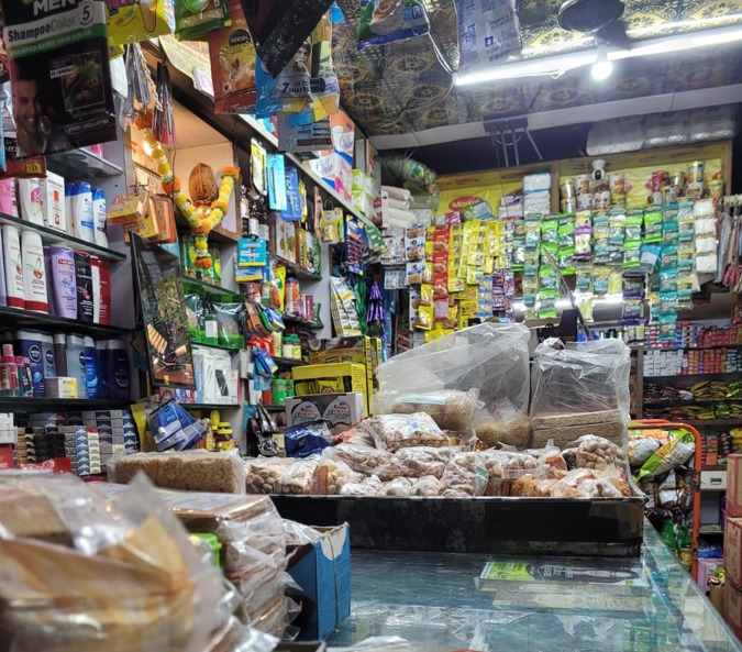
This is a type of store where people go looking for specific items that the store staff finds and brings to them. These stores rely on consumers’ trust that a specific product will be available, but they don’t have to hunt for it. The store staff is agile and relies on memory to find and keep track of what they have. These stores only have a store counter and all products are behind that. I’ll call this the Hidden Layout because consumers only have to ask for what they want and the inner layout is mostly hidden and inaccessible. The layout is fully dependent on the store staff’s convenience. Its biggest advantage is minimizing purchasing effort. But it comes at the cost of not indulging in unplanned shopping.
One unique feature of this layout is that the store staff guides the consumer on what to buy, suggests alternatives, and often promotes what they should check out. The staff acts as the store’s own marketing agent.
These shops have a free-form component where some products, usually popular and cheap items are quickly on display to encourage some unplanned shopping. But most visitors here are the planners.
When small stores get set up, they typically begin as a hidden layout. When they expand, they scale it up with a hybrid of freeform + hidden or grid + freeform.
| Layout type | Examples | Structure | Advantages |
|---|---|---|---|
| Grid layout | Grocery & home-improvement stores | Rectangular, grid-like shelves with aisles to walk, highly organized. | Very easy to scan and buy related things together, needs a lot of space |
| Freeform layout | Clothing shops, vegetable markets (bazaars) | Structured with a high variety of small sections | Promotes touching products, quality checks, and discovering interesting things, consumers can move randomly |
| Racetrack layout | Ikea | One single path from start to end, the surroundings are product categories | Maximizes exposure to products, efficient use of space |
| Hidden layout | Medical stores, kirana dukkans in India | Storefront where consumers ask for products, products are hidden or inaccessible | Minimizes the effort to purchase, purchases are guided and advised by the store staff, minimum use of space |
Sources
[2]: https://www.researchgate.net/publication/305640376_Retail_Shoppability_The_Impact_Of_Store_Atmospherics_Store_Layout_On_Consumer_Buying_Patterns
[3]: https://onlinelibrary.wiley.com/doi/abs/10.1002/mar.20709
[4]: https://edepot.wur.nl/369091
[5]: https://www.pinterest.com/pin/232357661997566351/

Hey! Thank you for reading; hope you enjoyed the article. I run Cognition Today to capture some of the most fascinating mechanisms that guide our lives. My content here is referenced and featured in NY Times, Forbes, CNET, and Entrepreneur, and many other books & research papers.
I’m am a psychology SME consultant in EdTech with a focus on AI cognition and Behavioral Engineering. I’m affiliated to myelin, an EdTech company in India as well.
I’ve studied at NIMHANS Bangalore (positive psychology), Savitribai Phule Pune University (clinical psychology), Fergusson College (BA psych), and affiliated with IIM Ahmedabad (marketing psychology). I’m currently studying Korean at Seoul National University.
I’m based in Pune, India but living in Seoul, S. Korea. Love Sci-fi, horror media; Love rock, metal, synthwave, and K-pop music; can’t whistle; can play 2 guitars at a time.
Help me run this site with a donation :)