I figured this out too late, but glad I did. I created the screenshot test to use on all of my social media content, blog posts, and app development with the companies I work with to improve shareability and the value of the information I present.
At this point, I have 5000+ screenshots on my phone since 2016. That’s about 625 screenshots per year, either taken for me to remember or send via WhatsApp.
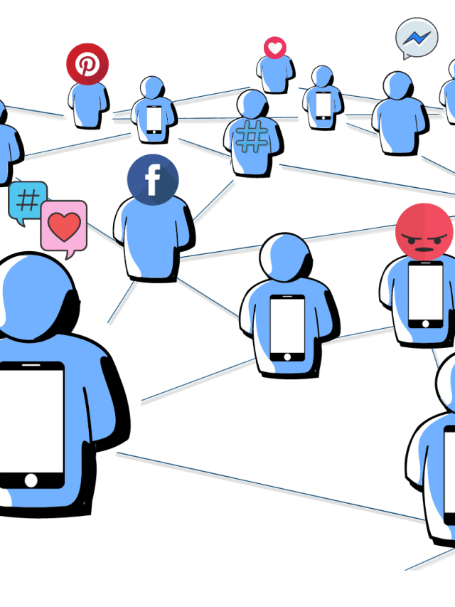
The wildest thing now is that one of the most shareable objects on the internet is not a link, it’s a screenshot or user-uploaded content on social media, which also tends to be an image with text on it. Memes are, by definition, the most shareable – how many of them have a screenshot format?! Users find more value in it because they don’t have to exit their platform, they don’t have to wait for any page to load, and they see an image on their phone… instantly.
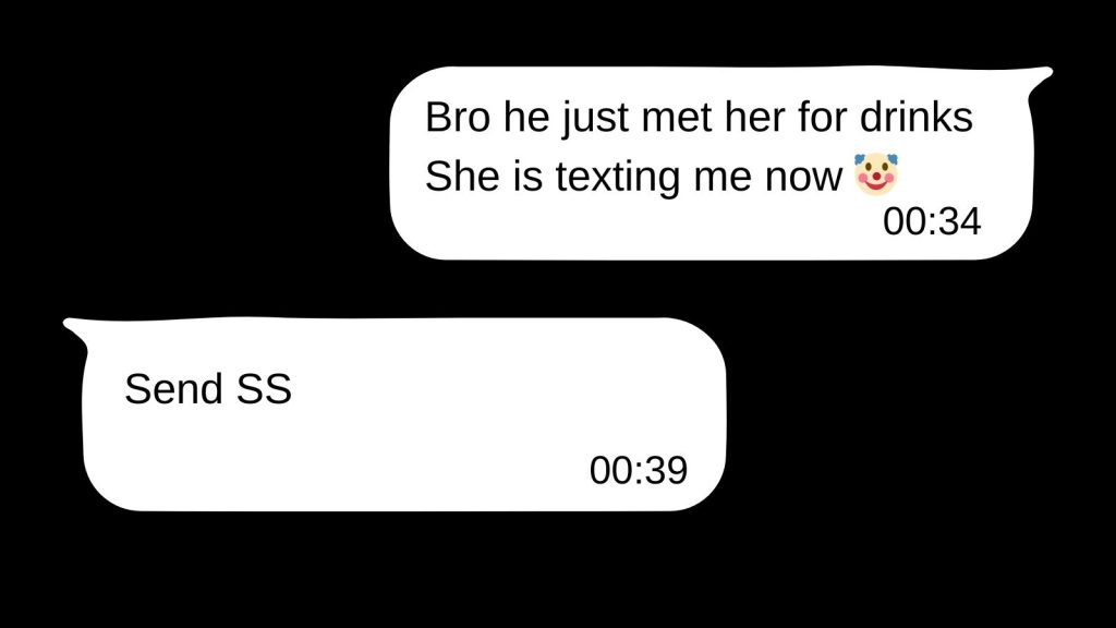
Reflect on your chats – How many times have people asked you “Send SS“? How many times have you made the effort for others to send an SS of only the relevant information instead of just linking it to them?
The button press screenshot, the snipping tool for custom-sized screenshots, the long screenshot, and the 3-finger gesture to capture a screenshot are now default behaviors we show on our phones. They are new habits we have acquired. We do them instinctively.
Taking a screenshot takes far fewer clicks to share and post. Images are also more welcomed on platforms to reduce link spam. Look at Reddit, most subreddits don’t allow links. But they do allow images.
Most people want their information with the least amount of effort. Why click on a link when you can see something useful directly on WhatsApp or LinkedIn? Why make a lot of content from scratch if a screenshot itself is meme-worthy?
Look at another case – some users upload amazing graphics of information. Do you save those to the phone or do you SS them? I personally SS them unless the images are really zoomed out with miniature elements and fonts.
How much is in a screenshot, you ask? I’d say just enough.
The Screenshot Test
📲 The Screenshot Test for usability and shareability of content
Does your app/content pass the screenshot test?
👉 If users take a screenshot of a page, is there enough VALUE and CLARITY in it at a glance for them to upload it to their socials or share it on WhatsApp?
✅ If yes, the information density is great, and the page is shareable.
❌ If no, the page can be optimized for information.
The philosophy: Low effort to view and share maximizes daily social engagement. Easy & compact = shareable.
You can screenshot this 🙂
Let’s look at the theory and technical story now.
The screenshot test is a powerful design heuristic that makes content worthy of sharing because of the simplicity and accessibility of a screenshot.
An exploratory survey study[1] of college students shows taking screenshots is treated as a social on-the-go activity, and most people use it[2] either to bookmark information (as an easier version of saving a file) and contain information (an easier way of recording information). Other uses are disclosing private information and reframing information by compactifying the useful stuff.
This matrix shows the usefulness and value of a screenshot.
| Bookmark (save information) | Contain (has relevant information) |
| Disclose (share authentic original details) | Reframe (compactify, highlight details) |
There’s another angle to consider – what skills make users engage with a screenshot? Researchers probed this question[3] and saw 4 competencies that users have that make a screenshot engaging for them:
- The user has knowledge of social trends and social norms – they know the screenshot culture, popular content formats, etc.
- The user has knowledge of self – they know what they want and think so they can take the screenshot and send a valuable screenshot.
- The user has the technical knowledge to understand the screenshot’s content & purpose
- The user has a visual competency to spot screenshots, understand why they are there, how to look through them, and quickly scan them for their value.
The 4 competencies here exist in your potential user who will share your screenshot.
Now, why should it be a test for good content? Let’s look at the UI and other behavioral aspects.
Information density in user experience design, informational hierarchy, ease of shareability in user interaction, and cognitive load are the roots of this screenshot test.
Help me run this site with a donation :)

1. Information density in user experience
Information density is simply how much information there is in a given space. In this case – how much information is there in a screenshot. More simply, how valuable and complete is the information without the need to scroll.
There are secondary conditions that relate to visual hierarchy such as information you can see at a glance and then information you can see after zooming in. This tends to be a tricky spot because creators make content with high value. But sometimes, high value means there is a lot of detail in it. People take high-density screenshots of infographics, diagrams, notes, long screenshots, or informational charts. These are still shareable because they are screenshots.
But, in most cases, a screenshot is taken when the density is just right for a goal. For example, a screenshot about a food recipe & instructions is good for that. A screenshot with a diagram and definition is good for that purpose. A screenshot of someone saying something relevant but that something appears in a long article is good for that purpose. In a way, a screenshot-able screen has ideal information density for a purpose users may have in mind (the 2×2 matrix above shows 4 common purposes).
2. Source credibility in screenshots
People tend to believe information that has some indication that it comes from a credible source. Friends and peers are one of them. Experts are another. Big branded companies are yet another.
Screenshots also indicate that the information is not interpreted and shared as is. So, there is more trust in the user’s eyes that the information is not tampered with.
So, the source credibility of a screenshot is magnified by:
- Social proof: It is shareable, and others have shared it.
- Epistemic trust: The information is as is, not interpreted, and not sensationalized.
- Processing fluency: We tend to trust information that is processed easily because the brain likes easy (check out the mere exposure effect and the illusory truth effect).
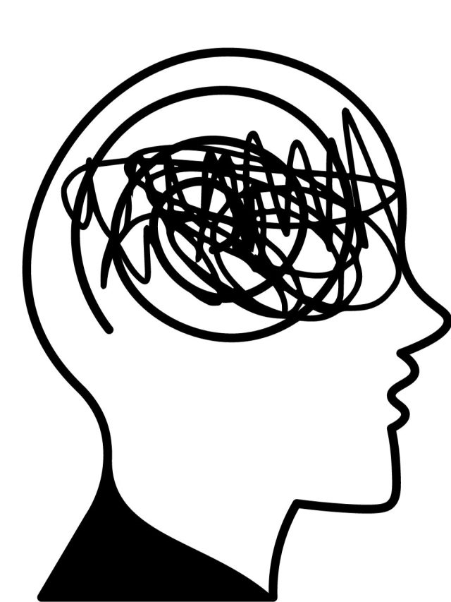
3. Cognitive load theory
Cognitive load is the overall demand put on the brain to acquire some information. That burden comes from the complexity and information density in a given space (intrinsic load), the noise and distractions in the environment (extraneous load), and the mental effort needed to learn that information and convert it into long-term memory (germane load).
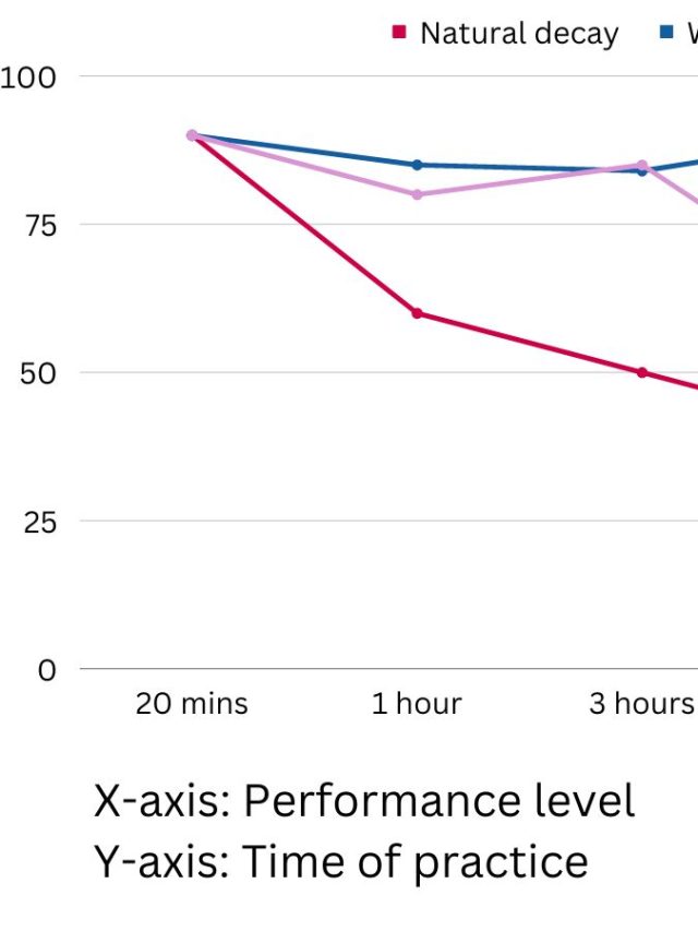
The general finding is that low cognitive load (all 3 combined) is very easy to process. It resonates with the KISS principle used in coding, business, and design – Keep It Simple Silly. People tend to share what’s easy – low cognitive load on the reader AND low cognitive load for the receiver of said SS. Medium cognitive load is best for learning. High cognitive load, aka too much effort, prevents users from engaging, learning, and sharing.
The screenshot test essentially eliminates extraneous load because the information is served to the user directly, in a contained, simplified format. By definition, the cognitive load tends to decrease because the user doesn’t have to navigate, perform extra clicks, find content on a page, read extra for context, get distracted from the app they are browsing (WhatsApp, Instagram, Telegram, etc.).
By passing the screenshot test, the content is easily understood & accessible at a glance.
4. Visual hierarchy
There is a visual hierarchy in visual design that applies to images, websites, apps, banners, adverts, etc. That hierarchy describes 2 things: What the user looks at with priority and what the creator intends to highlight. Matching the 2 is usually a good visual design decision. But without getting into the design elements, let’s look at this:
- A screenshot contains information that appears useful. So it either highlights a strong visual hierarchy or it eliminates the hierarchy.
- When it eliminates the hierarchy, only the useful content is shared and a user’s attention is drawn just to that. This means a screenshot is likely to eliminate or reduce the extra noise in the visual hierarchy.
A mini visual hierarchy is also created within a screenshot: Headings, bullet points, diagrams, captions, definitions, names, etc. If a screenshot contains the minimum required visual elements & information within a single screen’s space, the hierarchy is good. This visual hierarchy is not necessary, but it’s good to have.
There is also a hidden hierarchy outside the screenshot – the captions and previous text when a SS is shared in chat, the title and description of a public social media post.
Users typically consider sharing something that either strongly interests them or interests others. They show some level of empathy by considering if a share is useful/valuable to others.
The screenshot test means that the content is already valuable, simply because you thought taking a screenshot. They are instantly deemed clear and useful, or at least entertaining.
Another shareability point is SSs put a lesser burden on the recipient of your share. Fewer clicks to find the information, direct and complete image preview on social media, and the recipient doesn’t have to navigate at all to find something useful.
How you can make your content screenshot-worthy
Ensure your content goes through 4 refinements.
- Optimize the information density: Present enough valuable information without overwhelming users.
- Enhance the visual hierarchy: Use headings, bullet points, and visual elements to highlight key information.
- Ensure clarity and completeness: Make sure the content is complete, sufficient, and visible at a single glance.
- Design for shareability: Create visually appealing content that fits on a screen without scrolling.
If your content is not already SS-worthy, these 4 improvements will make it.
Sources
[2]: https://journals.sagepub.com/doi/abs/10.1177/13548565221089211
[3]: https://www.sciencedirect.com/science/article/pii/S2210656118300631

Hey! Thank you for reading; hope you enjoyed the article. I run Cognition Today to capture some of the most fascinating mechanisms that guide our lives. My content here is referenced and featured in NY Times, Forbes, CNET, and Entrepreneur, and many other books & research papers.
I’m am a psychology SME consultant in EdTech with a focus on AI cognition and Behavioral Engineering. I’m affiliated to myelin, an EdTech company in India as well.
I’ve studied at NIMHANS Bangalore (positive psychology), Savitribai Phule Pune University (clinical psychology), Fergusson College (BA psych), and affiliated with IIM Ahmedabad (marketing psychology). I’m currently studying Korean at Seoul National University.
I’m based in Pune, India but living in Seoul, S. Korea. Love Sci-fi, horror media; Love rock, metal, synthwave, and K-pop music; can’t whistle; can play 2 guitars at a time.
Help me run this site with a donation :)