After exploring thousands of studies and digging deep into hundreds of theories, I’ve noticed one thing – powerful marketing and consumer insights lie hidden within, which I will share with you now. Intentional or unintentional, there is a treasure trove of marketing applications hidden within half the research in psychology, and most research can be used to understand your target audience and consumer behavior.
If your marketing effort is not meeting expectations or not making the cut to beat your competition, this article is for you. Use these tips to rizz up your marketing game 🙂
- What is consumer psychology?
- 1. Human memory and attention is biased toward
- 2. Gamification is easy, in principle
- 3. Some consumer mindsets are more favorable while buying/selling
- 4. Users/consumers are happy or annoyed based on their skill and the product’s complexity
- 5. Effort heuristic
- 6. Symmetry Impulse: Thinking as a balance
- 7. Looks always matter
- Sources
What is consumer psychology?
Consumer psychology is a technical understanding of how and why consumers use products, services, and apps. Consumer psychology looks at consumer habits, user behavior, consumer satisfaction, consumer perception, etc. So, essentially, it looks at how a consumer interacts with a product. Consumer psychology insights are used to figure out what better can be done to make a consumer buy a product and stay engaged with it.
Consumer behavior describes a consumer’s needs, habits, emotions, motivation, preferences, past experiences, goals, expectations, etc. Understanding consumer behavior is essential to understanding if your product/service is appealing to your target audience.
Example: In designing a new credit card app that offers exclusive discounts, consumer psychology can inform issues like trust and transparency. Designers could tweak the interface so the app feels familiar to show it is not some unusual, risky app.
Marketing psychology is a way to use insights about human behavior for better marketing of products and services. Marketing psychology looks at human decision-making, biases in attention and memory, what humans need or perceive they need, etc. Marketing psychology is generally used to make better advertisements, products, and packaging and build a brand’s story. From there, the next logical step is to align a brand with consumer psychology.
Example: If a team of psychologists and marketing professionals discuss how to make a Coffee appealing by making its packaging appealing, they are using marketing psychology. They may want to focus on coffee enthusiasts’ interest in working long hours, they can change colors to resonate with their preferred aesthetic, and they may also add an image of a grand mountain from which the beans are sourced.
Main difference between consumer psychology and marketing psychology is that consumer psychology focuses on consumer engagement and interaction, while marketing psychology looks at grabbing consumers’ attention and persuading them.
The points I discuss below affect both.
1. Human memory and attention is biased toward
- Faces and body parts[1]: All human body parts have a strong neural representation in every human’s brain. This means body parts get a lot of mental resources. The same goes for consumers. The brain is readily aligned to pay attention to body parts. Hands, feet, necklines, faces, muscles, etc., almost always grab attention.
- Cute animals and child-like features[2]: Any form of cuteness, such as babies, animals, pets, big-eyed robots, abstract designs, etc., grabs attention and focuses it on small details (the kawaii effect). This makes cute elements a powerful tool to grab consumers’ attention.
- Negative details[3]: The brain has a negativity bias that highlights negative information, gives it more value, and instinctively makes us think of safety. Accidents, horror, sickness, etc., grab attention because our brain first thinks of its own safety.
- First and last items[4]: The primacy effect says people remember the first items in a list. The recency effect says people remember the most recent or last items in a list. Most people forget what’s in the middle. So the position of advertisements on a website or the placement in a chain of advertisements between a sports game, etc., make a huge difference to what the consumer recalls.
- Locations[5]: Locations, in the strictest sense, are a layout of information. Diagrams, arrows, positioning, etc., are persuasive and simpler to understand than paragraphs. Because of a bias toward locations, mentioning words like “path”, “journey”, city names, etc., works well.
- Contrasting details[6]: Across studies, this is called opposition or incongruent stimuli. It simply means that a consumer will recall an advert better if it contains 2 opposing elements or attitudes. Rich person and poor person combos, short and tall person contrasts, etc., grab attention. Similarly, imagery of fire and ice can create incongruence that is memorable. Researchers propose this happens because it makes the advert simple by forcing the consumer’s brain to think only about the contrast and nothing else.
- Positive feelings:[7] Consumers typically want to feel better by the idea of consuming something or feel better by getting rid of a problem they have. So, their attention is biased toward any information they consider rewarding. This is why food imagery, sexual imagery, feeling wealthy, etc., work well in the advertising industry. They tap into the consumer’s desires that make them feel good.
Use these elements in your marketing and messaging for higher consumer recall and more attention. Here’s a visual version of this section to remember it better.
2. Gamification is easy, in principle
Gamification is a fancy term to make a product/app interactive with the use of elements traditionally seen in games. The goal is usually to increase user engagement, which indicates high user motivation.
- Use humanness via avatars and fantasy
- Increase a consumer’s sensations with colors, animations, and changes.
- Show a user can feel “lucky”
- Use familiar user habits
- Adopt “play” mechanisms from games
Not all games are social, but social elements naturally gamify. Having a way for one user to interact with another is an opportunity to make a product “playful”. Example: The classic “poke” feature of Facebook (now meta).
3. Some consumer mindsets are more favorable while buying/selling
Consumers can be classified into personas based on their stereotypical needs, wants, and situations. But another less costly alternative is to classify consumers based on their typical mindset. That mindset ties in with their identity because their profession and possessions reflect their consumer choices. I highlight 3 easy mindsets to figure out just by observing their typical purchase history and interests.
- Scarcity mindset: If it’s rare/depleted, they want to buy. Consumers with a Scarcity mindset prefer to obtain whatever is running out of stock or likely to run out of stock. Hoarders fall into this category. But so do most typical consumers. They value certainty, safety, and security. They are risk-averse and often think long-term.
- Frontier mindset: If it is new and innovative, they want it. Consumers with a Frontier mindset want to be on top of the trends and frequently believe “new is always better.” They also prefer to take risks. They put in the effort to learn more and dive deep into the products they purchase. The tiny quirks of a product, the extra features, and the “fluffy” gimmicks all matter to them.
- The path dependency mindset: If it works, there is no need to upgrade. Path dependency is an economic concept that suggests people’s choices are restricted by their previous choices and habits. At the ground level, this means if people are used to something – and it works. They will not opt for a change. This mindset makes people risk-averse.
4. Users/consumers are happy or annoyed based on their skill and the product’s complexity
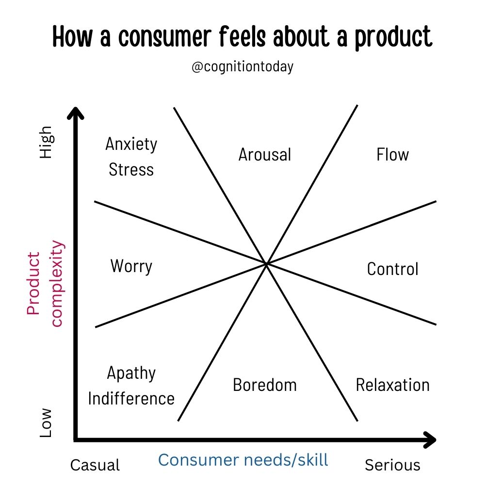
The combination of a consumer’s skill/knowledge and a product’s complexity is derived from the experience fluctuation graph.
- Hard product + low user skill = annoyed user
- Hard product + high user skill = excited user
Product complexity (hard product): Describes a product or service’s ease of use, the number of decisions a consumer must make, the list of features and use cases, customizability, etc. Cognitive load is a general concept that describes this, but I’d prefer to use product complexity because cognitive load also applies to non-product features like the consumer’s personal difficulties, financial burden, etc. For digital products, product complexity is more closely tied to user interactions and user experience. Simplifying a complex product changes the perceived difficulty a consumer feels. Tip: No one has to know all the features a product has from the start. Feature discovery brings joy to a consumer (read point 5).
Consumer skill/needs (high user skill): Describes what level of background knowledge or expertise the consumer brings to the product. Power users love complex products because there are hidden features they can use. Casual users want the simplest product that does what they need without thinking much.
With a combination of both, a consumer feels 8 different feelings. Described below.
5. Effort heuristic
If users put effort into acquiring something, they inflate its value. Value is proportional to the effort that goes into something.
- Make ads that show the effort that goes into a product.
- If it’s easy to make, users rarely pay.
Ideally, if a consumer is new to a product or product category, they are walking into uncertainty and taking risks. That is generally not a good thing because people are risk-averse. To offset risk-averseness, brands can show the effort that goes into the product. So, show how the product is made, how much R&D went into it, how many iterations were discarded, how much precision went into refining it, etc. A direct indication of effort primes the consumer’s brain to think, “This seems like hard work; it must be good”.
And if that is not enough, they can show the user can customize the product and make it their own with some effort. A consumer who spends a lot of time using a product now evaluates the product based on the personal effort that goes into it. When they customize an app or find their personal way to use an appliance, they love it more. When they discover, “Oh this product can also do this!” they are happily surprised.
6. Symmetry Impulse: Thinking as a balance
Humans are driven to assume there is always a balance of good and bad. As if a product always has pros and cons. They believe the better a product is, there is some equally proportional downside to it (and it’s not just the cost that’s a downside). People do this for very complex reasons for which we don’t have clear answers. I explore multiple answers in this article.
Example:
- Good medicine must have bad side effects.
- A brilliant free offering must be a scam.
- The perfect AC must be a disaster to the environment.
Tip: Make extra effort to show something good doesn’t mean it has a downside.
7. Looks always matter
200 milliseconds, and we form our judgment on appearances. Neuroscientists called it “visual precedence” – the brain’s tendency to first evaluate visual and spatial information to make meaning out of stimuli. That is why products and brands need to create a strong first impression with design.
- Plainness penalty: If something looks bland, we pay less for it.
- Beauty premium: If it looks good, we pay more for it.
There’s a lot more: Looking suspicious, even when not doing anything wrong, breaks trust. Cute animals are given human qualities.
Learn more about how the brain prefers and processes visual information here.
If you like these insights and want more for free, please buy me a coffee to help me create more content like this 🙂[8]
Sources
[2]: https://www.frontiersin.org/articles/10.3389/fpsyg.2016.00298/full
[3]: https://journals.sagepub.com/doi/abs/10.1207/s15327957pspr0504_2
[4]: https://www.tandfonline.com/doi/abs/10.3200/GENP.132.2.151-164?src=recsys
[5]: https://jov.arvojournals.org/article.aspx?articleid=2191865
[6]: https://www.sciencedirect.com/science/article/abs/pii/S0148296311002797
[7]: https://psycnet.apa.org/record/2015-42376-001
[8]: https://www.buymeacoffee.com/adityashukla

Hey! Thank you for reading; hope you enjoyed the article. I run Cognition Today to capture some of the most fascinating mechanisms that guide our lives. My content here is referenced and featured in NY Times, Forbes, CNET, and Entrepreneur, and many other books & research papers.
I’m am a psychology SME consultant in EdTech with a focus on AI cognition and Behavioral Engineering. I’m affiliated to myelin, an EdTech company in India as well.
I’ve studied at NIMHANS Bangalore (positive psychology), Savitribai Phule Pune University (clinical psychology), Fergusson College (BA psych), and affiliated with IIM Ahmedabad (marketing psychology). I’m currently studying Korean at Seoul National University.
I’m based in Pune, India but living in Seoul, S. Korea. Love Sci-fi, horror media; Love rock, metal, synthwave, and K-pop music; can’t whistle; can play 2 guitars at a time.

