Gamification is an attempt to make a website or app more fun and motivate users to use it. This is done by employing elements from successful popular games and classical principles of human behavior. The underlying goal is to offer the app’s features in a way users benefit as much as possible.
A gamified app needs: Feedback, designs that motivate, rewards, goal-directed behavior, high positive emotions, a fun interface, and anticipation for what’s next. Throughout the article, I’ve focused on having fun with the app multiple times, this is because fun naturally improves motivation, engages the brain, improves memory, and associates mundane tasks with positive emotions.
I’ve broken down gamification elements according to their psychological components. Here’s a visual story of this article, if you don’t want to read much.
- 1. Use prior knowledge and user habits
- 2. Visual and navigation elements from actual games
- 3. Tension and release moments
- 4. In-app challenges
- 5. Varied sensations through feedback
- 6. Reducing Uncertainty and story building
- 7. Incentives for user motivation
- 8. Reward planning
- 9. Human-ness and social connection
- FAQs
- Sources
1. Use prior knowledge and user habits
For an app or site’s user interface and experience to be fun and interesting, but not too challenging, the creator has to use behaviors that already exist in the user. I classify these behaviors in 2 ways.
Process habits
Process habits are how things get done in a game or app. These develop from trends in design and what users are used to doing. For example, there is a standard way everyone buys on e-commerce, the processes is the same. If it feels different, the user feels off about the app and hits the back button.
Movement habits
Movement habits are literally how users use their fingers on the screen. Long press, right/left swipe, scrolling motion, double tap, etc., and very standard behaviors on a mobile screen. So a gamified app must meet this minimum requirement for how users use the app. Beyond these, other elements like rewards, story-building, incentives, and sensations gamify.
Let’s build a simple foundation for what gamification is. An app must feel and work like a game. And the first things to create that feel are the visuals and navigation. Looks matter, particularly in technology. If the general feel of the app resembles a game, it will feel gamified. This is a design problem, to gamify this way, designers should consider what features of an app and what user flow can borrow visuals from popular games.
At the very least, movement in the app’s UI, real-time changes to design elements, and some silly playful activity can gamify the app.
Users are likely to enjoy an app if the reality presented by the app is immersive. If it briefly transports the user into a new reality with design elements, the user feels like a character in the app’s story.
3. Tension and release moments
Anticipation of a reward spikes[1] dopamine in the brain which increases motivation[2] for reward-seeking behaviors. So if the user senses that any action is about to create a reward, the motivation to stay on the app increases to see that reward. The reward here isn’t truly a reward per se. Satisfaction, momentary joy, completion of a task, pleasure, and even a fun new stimulation is a reward. Without going into too many details, this is a very important gamification lesson here.
Remember screen savers where a colored cube bounced around the screen? Remember the Netflix loading screen percentages? Wouldn’t you get a mini panic attac if the number stuck at 24% and suddenly jumps to 99% and then 100%? Humans love the ups and downs of watching something happen. The tension + release of tension fully grabs the user’s attention.
Imagine long-pressing a balloon till it starts enlarging. And as it blows ups, it pops with a very satisfying sound and shakes on the screen. Gamification needs features that allow a user to experience that in a way that’s consistent with the app’s brand and function.
4. In-app challenges
A good game is a challenge that opens the door to positive emotions like joy and excitement and negative emotions like frustration. So a gamified app must have some element of challenge. This ties to the user’s need for achievement and progress. Part of the fun is the progress, that is winning or losing. Moderate challenges, milestones to achieve, progress tracking, etc., improve the sense of challenge because the user can benchmark their behavior on the app and then increase it.
When figuring out how a task is done on an app, the creator should consider a user’s current skills and the difficulty of the task. The combination of the 2 create 8 different “feelings” about the task. I’ve discussed them in depth here, but here’s a chart for a quick review.
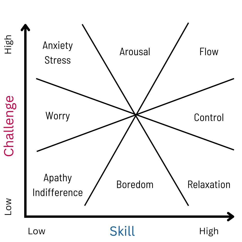
For successful gamification, the user should feel Arousal, Flow, Control, or Relaxation. Anxiety in small doses works in games but might be counter-productive for wellness and health apps. It might work for social apps. YMMV. Anxiety effectively leverages the tension and release moments I’ve discussed above.
5. Varied sensations through feedback
Humans are sensory creatures, unlike computers. The beauty and enjoyment on this earth, in this universe, is about the senses. Food, sex, music, games, gymming, sport. All are about a specific kind of sensory experience. To tap into this approach, a gamified app will have exciting sensations. I consider 3 types of sensations.
- The feedback sensation: When an event takes place on an app, like onboarding, finishing a task, there must be some feedback in at least 1 domain: visual, auditory, or haptic feedback. This makes the user feel connected to an app and the user’s action on the app is correct.
- The bling sensation: Bright colors, sparkly changes, visual chaos, etc., make an app feel fun. Clean UIUX doesn’t mean it has to tone down on sensations. It just needs good placement.
- The escalation sensation: Some sensations should be about completing a task and they cannot be re-used for other events like loading, curating, logging data, etc. If the user has the same sensation for all tasks and events, the subtle excitement of that sensation goes away. So different sensations for different events. However, the sensations should also tell a story. For example, in a game where the user solves puzzles with a time limit, 1-star record time can have a yellow burst of lights on the app. A 2-star record time can have a yellow burst with some red and a more chaotic cheer. A 3-star or perfect score can have all of that plus some extras. This builds a story in the type of sensation the user gets and keeps it differentiated too.
A book isn’t a game because it lacks real-time feedback. Feedback is a necessary but not a sufficient criteria for something to be a game.
6. Reducing Uncertainty and story building
Micro story
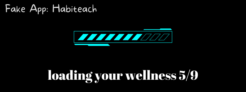
During wait and dwell times in an app, the user is in a state of uncertainty. The user doesn’t know what’s happening at the moment, just the outcome of their action like a click or a swipe. Take a game’s loading screen as the prime example. When a user loads a 500 MB game, it often takes at least 10 seconds on most phones. In the 10 seconds, a shooting game will have messages like “loading guns”, “preparing tactile teams”, configuring comms”, etc., as the loading screen progresses with different background designs. This gives the user a reason to wait in anticipation because it does 2 things: Reduce uncertainty and build a story.
Macro story
The entire app should feel like a story in which the user progresses and unfolds new things. This is a branding angle where the design throughout the user journey feels cohesive. There are visuals that indicate progress and new chapters. Storification of an app is a gamifying technique where the user automatically knows “why they are on the app” because they are now the “main character” in the story told by the app.
Think of your user as a main character in a game who progresses through your services. Share on X7. Incentives for user motivation
The app and its features are designed with a goal because the app wants to offer a service. Their value offering is the incentive. But to gamify, additional incentives can help. The company whose app it is can break down its ultimate value offering into micro goals. These are specific things a user values in the journey. For a fitness app, good health is the original incentive. But water intake, exercise logging, sleep records are micro goals that the user values. The user is motivated to use the app because they want to have water, exercise, and sleep. For each of these incentives, there are consequences like progress, badges, points, fun new “unlockable” items, status symbols like ranking/levels, etc., that act as a reward. The incentive motivates the user, and rewards sustain that behavior.
Incentive = Motivation || Reward = Outcome/Consequence
Apps often incentivize users to go to the “purchase” page by offering discounts. Another incentive is to give users the chance to earn extra points or rewards by logging in daily.
Intrinsic reward to use an app comes without incentives. It comes from the gamified design, the tension and release, the sensations, the sense of challenge and progress, and finally, a habit to use the app.
8. Reward planning
Gamification relies on how a stimulus creates a response, and how variation in that stimulus creates variation in responses. The stimulus is what happens in the app and the response is what the user does. Behaviorism, an experimental approach to predicting behavior, gives us key insights into how an app’s features become rewards, encourage some behavior, or discourage some others, using a stimulus-response theory called operant conditioning.
The general principle is: A rewarded behavior increases and a punished behavior or reward-less behavior decreases. For gamification, we will only look at encouraging certain behaviors with the assumption that a particular usage should not be punished.
Operant conditioning models how humans increase or decrease a behavior according to rewards. The algorithm to deliver the rewards is based on the “schedules of reinforcement” which means the “plan for how and when rewards are given”.
For gamification, we need 1 particular insight the most: Rewards given unreliably and rewards with varying magnitudes increase reward-seeking behavior the most because the user wants to maximize the reward. This is called the variable ratio schedule of reinforcement. It means that a reward is given after an unknown amount of responses. For an app, the rewards in the app do not go to the user every time they use it. Users are rewarded in an unpredictable way. To gamify, we do the same. We manipulate the frequency and intensity of the reward to maximize the user’s interest in using and enjoying the app. It’s essentially how gambling works – users get to play repeatedly with some lucky tries giving big rewards.
Humans love to feel lucky, so that element of randomness in how rewards are given tries to cash in on that lucky feeling. Whether people make predictions or feel lucky, the randomness is enough to for users to figure out patterns and do guess work, making them excited to “win” the rewards. When they make predictions and not get rewards, they are motivated again to beat the game. This is a way to get users invested in apps.
There are many ways to offer rewards according to different schedules of reinforcement. I’ll use a fitness app as a model to show how you gamify and deliver the rewards. Each schedule of reinforcement will modify user behavior.
For ease: Consider every response as a user action on the app.
Continuous Schedule
The user receives immediate reinforcement (rewards, points, badges) every time they log an exercise session. Every workout log gets a reward.
Outcome: Continuous reinforcement provides immediate rewards for every exercise session logged, while intermittent schedules create a varied patterns of reward delivery, potentially encouraging the user to maintain regular exercise habits.
Intermittent Schedules
- Fixed Ratio (FR) Schedule: The user receives reinforcement after a fixed number of logged exercise sessions. E.g., every 5 logged sessions, they receive a reward.
- Fixed Interval (FI) Schedule: The user receives reinforcement for the first logged exercise session after a fixed period of time has elapsed. E.g., if the FI schedule is set to 1 week, they receive a reward for the first exercise session they log after 7 days.
- Variable Ratio (VR) Schedule: The user receives reinforcement after an average number of logged exercise sessions, but the exact number varies. E.g., on average, they receive a reward after every 5 logged sessions, but sometimes it might be after 4 sessions, and other times after 6.
- Variable Interval (VI) Schedule: The user receives reinforcement for the first logged exercise session after an average time interval, but the exact interval varies. E.g., on average, they receive a reward for the first session logged after 1 day, but sometimes it might be after 6 days or even 2 days.
Outcome: Fixed schedules will lead to predictable patterns of behavior, while variable schedules promote consistent engagement and reduce predictability.
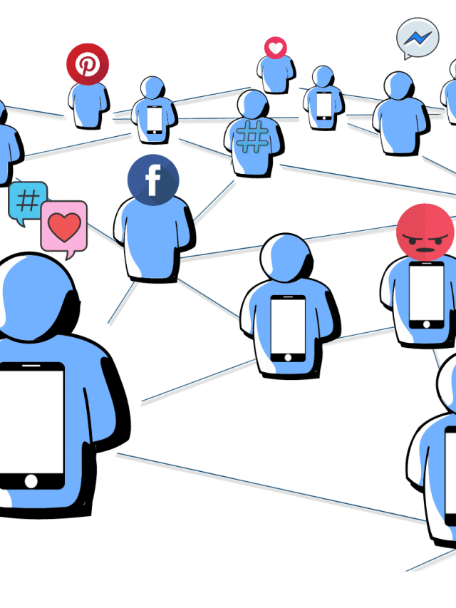
Some apps are inherently social and some are not. Still, having a user-to-user connection can make an app lively. Gamification here is more of a social connection that occurs via the app or allied products like forums, communities, subreddits, etc. Oneplus did this well by making the phone purchase a social game of sending out referrals, signing up to be in the queue to be the first few owners. They also had a dedicated community for Oneplus users to talk about anything.
If the app is not a social app, adding a human touch helps users connect with it better. This is done by anthropomorphizing elements. Chatbots are given human names and a face. Human faces are used in the design. A user’s avatar is customizable. Activities are branded with human qualities. Essentially, if something in the app can be humanized, it appears gamified and social.
FAQs
Candy Crush took the world by storm by hacking human behavior. In candy crush, users always win something and progress when they open the app. There is a flurry of high-intensity colors and sounds with positive emotions. But because of randomizing factors, the intensity and frequency of progress is variable. Since users knew the progress is uncertain, they maximized opening the app to seek maximum joy.
Intrinsic motivation (the reason for fun and enjoyment) to use an app comes without incentives. It comes from the gamified design, the tension and release, the sensations, the sense of challenge and progress, and finally, a habit to use the app.
Want to gamify your app? Book a call with me.[3]
If you like this, do check out my strategy for making a killer app!
Sources
[2]: https://onlinelibrary.wiley.com/doi/abs/10.1111/j.1600-0447.2005.00540.x
[3]: https://www.buymeacoffee.com/AdityaShukla/e/83405?from_page=extras

Hey! Thank you for reading; hope you enjoyed the article. I run Cognition Today to capture some of the most fascinating mechanisms that guide our lives. My content here is referenced and featured in NY Times, Forbes, CNET, and Entrepreneur, and many other books & research papers.
I’m am a psychology SME consultant in EdTech with a focus on AI cognition and Behavioral Engineering. I’m affiliated to myelin, an EdTech company in India as well.
I’ve studied at NIMHANS Bangalore (positive psychology), Savitribai Phule Pune University (clinical psychology), Fergusson College (BA psych), and affiliated with IIM Ahmedabad (marketing psychology). I’m currently studying Korean at Seoul National University.
I’m based in Pune, India but living in Seoul, S. Korea. Love Sci-fi, horror media; Love rock, metal, synthwave, and K-pop music; can’t whistle; can play 2 guitars at a time.


