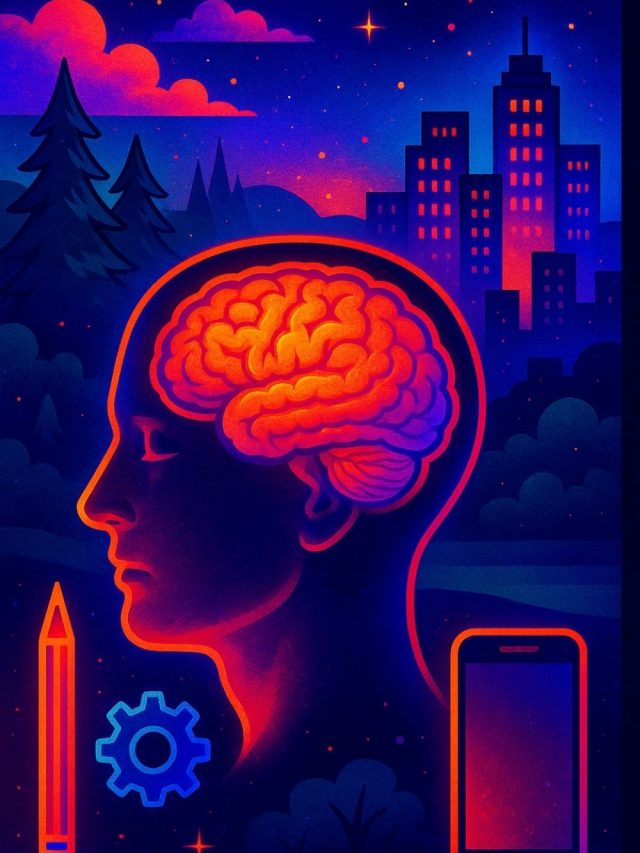
What makes a mindblowing app? Clean, intuitive UI? Bug-free? Does what it’s supposed to do? These are the minimum requirements for a good app. Whether you are making an educational app, a fintech investing app, a fancy game, a social app, or a silly game, intuitive use and working as expected should be a given. What more can you do to make it stand out?
Many psychological principles help in app design. I’ve reorganized the most important ones under 8 functions that serve users’ needs. If your app includes just a few of these features that perform a psychological function through its UI/UX, your app is more likely to keep its users engaged.
1. A security blanket
The app makes the user feel safe and comforted when feeling bad about something. A security blanket function is an app feature that lets you feel comforted, just the way children have a favorite blankie they like to sleep with. Like IG, YT, and a baking game, it’s a safe space – the user can find something comforting in it. But, sometimes, the app isn’t just a safe space. It’s a happy place.
If you are feeling lonely, chances are you’ve picked up your phone to do something. Perhaps Instagram or Youtube, where you may hear a voice and see faces or connect with content creators who give you something you like. Instagram has won at this classic security blanket function.
But there is another level to it – security via uncertainty reduction. Similarly, if you are browsing on Netflix and can’t decide, Netflix plays a long snippet from a movie to show you what you’ll get if you hover over the thumbnail. The preview function is one of the newest, most successful uncertainty-reduction techniques. It helps us avoid possible regret – what if the movie is bad?
Generally speaking – a negative emotion or an unmet need creates an opportunity for an app to offer comfort. And a method to offer that comfort reduces stress, uncertainty, and future regret.
If you figure out an emotional or utility need for a user, you can offer a feature that caters to that need. So your app becomes a coping mechanism or a go-to tool.
Spotify and other music apps become a security blanket too, because music is generally comforting. It improves our mood, distracts us, or mildly entertains us in the background while working. Since many everyday tasks and work tasks can be done with music, these apps can provide more comfort even when it isn’t truly needed.
A security blanket creates emotions like safety, preparedness, wishful thinking, uncertainty reduction, and regret-aversion
Features ideas: Photo reminders, social connects, positive stories, fun activities, and prompts to engage a distracted mind
Apps that use them well: Pinterest, YouTube, Instagram, Spotify
2. A sword
The app makes the user feel prepared and ready for the world. Linkedin has become a sword – everyone wants to show how sharp theirs is. It’s a legitimate place to brag about your wins, cover up the failures, use big words and announce to the world you are successful and prepared. This is a psychological sword.
Another way to look at a sword is advanced utility – that’s when the sword becomes a sophisticated tool. A single app that lets you convert file types could be of immense use to someone in an administrative position. For them, the app creates a sense of preparedness and readiness for novel problems.
A handy bar-tending guide or easy keto-recipe book acts similarly. Design tools like Garageband, Canva, Sketchbook, etc., serve a similar function. They cater to a specific need for unknown challenges a job throws at you.
Some apps are contextually very important – you’ll have them when you are at a particular location, or you’ll have them during a project. Dictionaries, language translation, language and culture guides, etc., are more useful in a short period, and you would probably not keep revisiting them.
We use the camera and screenshot to record…. obvious, right? But the motivation to do this sometimes is to attack others – “I’m sending this chat record to your friend, they’ll know what you did.” or “Do it, I’m taking a video, and you can’t stop me, let’s see what you think.” So for the sake of healthy technology use, I won’t include these under the sword function.
A sword function makes the user feel prepared for everyday and unique challenges. But it also acts as an offensive tool, which has its downside.
Features ideas: Strong instructions and knowledge centers, a cluster of utilities in editing apps, recording and logging user history/activity
Apps that use them well: WikiHow, Canva, e-wallets
3. A shield
A shield app lets users protect themselves from specific fears like fear of judgment, fear of data theft, fear of feeling incompetent, fear of facing criticism, fear of losing data, and fear of getting misinterpreted. A shield would be a feature that protects you, like no data tracking, or chat history that proves you were right, or a tool that makes you feel smart. It protects from confusion or misuse.
A shield app/feature lets you work similarly to a security blanket but is more tailored to tangible threats. A security blanket is more tailored to psychological comfort.
Our habit of googling for information during conversations, using call recording, pointing the camera to capture what others are doing, keeping screenshots of old conversations, etc., are all responses to threats. These behaviors are how we shield ourselves or others.
A shield makes the user feel safe and protected against real security threats and other social threats like feeling stupid.
Features ideas: encryption, antivirus, chat history, anonymity, simplified tools, low-difficulty high-productivity tools, screenshots, clear input responses
Apps that use them well: Antivirus software, Snapchat with its screenshot notification, Amazon’s Alexa assistant with clear, useful input and response choices for customer support
4. An external brain
The external brain concept describes an app that lets users access a network of information to supplement their brains. For an external brain to work, the app needs excellent navigation embedded in the UI, because people remember where to find information better than the potential information. This is called “the Google effect.” The external brain becomes a knowledge source in which you have faith and cultivates a neglected part of human memory called “transaction memory” – the collective store of information you have access to. The Google effect emerges from our faith in Google being the messenger for all our information needs.
Instagram’s save feature or Chrome’s easy bookmarking feature is a great example of how we store knowledge and useful content externally. Reddit bots that remind you of a post later are another smart way to implement the external brain function because our attention span is limited, and we users often forget what we want.
An external brain makes us feel smart, prepared, resourceful, and also helped.
Help me run this site with a donation :)

Features ideas: Quick tips, list of resources, easy navigation, note-taking, bookmarking, collaborative features.
Apps that use them well: Wikipedia, dictionaries, code tutorials, Coursera
5. A portal
The app transports the user to a better situation where they can seek rewarding experiences and satisfy their psychological needs. Most games offer this – it functions as an escape pod for a more rewarding reality. Instagram and YouTube also act as a portal. Podcast apps like Google podcasts, learning apps like Coursera, and reading apps like Kindle are also portals. They transport you to an engaging psychological space where you are disconnected from the world.
Spotify is an excellent portal too. Music, in general, is a good way to shift your attention. Portal apps need resources that grab attention in very efficient ways. Variety from Instagram and Kindle, e-commerce browsing (creating a wishlist), and music are successful portals, but they can’t be easily replicated. The alternative is games or gamification. Both would serve the function to an extent.
A portal must create a fantasy or a rewarding situation where the user feels great – making a wishlist or stress-shopping is a common coping mechanism. Users fantasize about themselves in a better situation by imagining themselves with better clothes/gadgets or vacations. Sometimes it’s wishful thinking, where the app convinces the user that there is a better life for the user or pure fictional rewards like in a game.
A portal app makes users feel good and imagine themselves in a fun alternate reality.
Features ideas: Engaging stories, previews, customization for clothes/gadgets/travel, a large collection of entertainment, mini-games, full-fledged games, interactions
Apps that use them well: Kindle, AAA games, fun short instant gratification games like Call of Duty or Polytopia
6. A lucky charm
A lucky charm app creates an opportunity for rewarding notifications and activities at random intervals as if you have a lucky charm and having the app makes things better. Random rewards at random intervals are powerful in keeping users engaged.
To continue engagement with an app, there has to be a balance between expectations and unexpected interactions/call-to-actions. The expectation part indicates user satisfaction – did the user get what they wanted from the app, and are they happy with the result? But the expected part is the core game-changer – it’s what Candy Crush nailed. They used variable-ratio-variable-reward reinforcement. It is a behavior principle that says we increase our behavior the most when we get random rewards at random moments for doing that behavior. It works better than receiving predictable rewards to increase the behavior. Basically, if the app creates unexpected joy, the user will be motivated to continue using it.
When it comes to social apps that use this, there is a starting point where an app user may not have followers, friends, connections, or very minimal activity. So the app has to generate positive notifications at random, so the user feels rewarded for using the app. Otherwise, they may think – I’m not getting anything from this app; I won’t bother.
Positive messaging and notifications are the 2 strongest ways to make a user feel rewarded if there isn’t a real reward like discounts, bonus points, or other digital rewards to offer.
People procrastinate with their phone because an app is making them feel better than their work is, that’s a mindset many of your users will have.
Features ideas: Random reward points, social media notifications, offers and promos, unexpected positive notifications, completion of a background task, prompts to seek something exciting
Apps that use them well: Social media apps, Zomato
7. Lifeforce connection
An app that interacts with the user, has a human touch, a face, and offers a response/feedback feels alive, and humans connect better with things that are alive. Plus, people use apps with an expectation – they want something from it. When those expectations are violated, it’s harder to trust the app. It becomes unreliable, or there is a mismatch between the user and the app. So an app with a good lifeforce should clearly set expectations and deliver on them.
For a lifeforce connection, customization is important too. People generally like to customize their apps or products, so they get to make them personal. Customization is connected to identity, and identity usually becomes a way to glue a person to an app – if it looks and feels like me, I want to use it. However, the identity lies in the interaction between the app and the user. It is a relationship.
Design elements like movement, animations, and instant feedback for a user action can also make an app come alive.
A lifeforce connection makes a user feel an interpersonal bond with an app. The user gets a sense that the app is alive and intelligent. It taps into the human need for connection and reciprocal interaction.
Features ideas: Avatars like those used in Snapchat, customization with theme colors and news feeds, interactive designs, smooth, logical flow and in-app recommendations for how to use it, in-app responses like “good job” or “now do this next,” emotional faces, etc.
Apps that use them well: Duo-lingo
8. A Helping Hand
A good app reduces the user’s burden of solving their problem by helping them in intuitive and tangible ways directly through the app’s user experience. End-to-end solutions, graphic editors, last-mile delivery apps, and dining/delivery apps like Ubereats and Zomato have realized this, and they make everything easier for the user. However, there is a trick to making things easier – it can’t be passive easiness. The user has to engage and put in the effort to use the easy solution, so they feel they are in control and have a choice in their decisions.
Your app can maximize the helping hand function by eliminating choice overload – when we have too many options to choose from, we get stuck and fail to make good decisions. So a helping hand app reduces choice overload and gives reasonable recommendations or options to choose from.
A helping hand creates emotions like making us feel in control and competent.
Feature ideas: Contextual details like store location, strong recommendations, alternate recommendations, easy chat support, 1-click purchases, and user-centric filters, tips for user actions, clear availability of functions and knowledge
Apps that use them well: Amazon, Ubereats, Google maps (showing hotels, food stops, and businesses while viewing routes)
Summary
| Your app should be… | Emotional Function (user feels this) | App Features |
|---|---|---|
| A Security blanket | Feeling Safe, comforted | Photos, social connects, positive stories, fun activities, prompts to engage a distracted mind |
| A Sword | Preparedness | Strong instructions and knowledge centers, a cluster of utilities in editing apps, recording and logging user history/activity |
| A Shield | Protected from real threats | encryption, antivirus, chat history, anonymity, screenshots, clear input responses |
| An External brain | Smart, prepared, helped | Quick tips, list of resources, easy navigation, note-taking, bookmarking, collaborative features |
| A Portal | Good in a different reality, escape from difficulties | Engaging stories, previews, and customization for clothes/gadgets/travel, large collection of entertainment, mini-games, full-fledged games, interactions |
| A Lucky charm | Random rewards | Random reward points, unexpected positive notifications, completion of a background task, prompts to seek something exciting |
| A Lifeforce connection | Connected to an app | Avatars like those used in Snapchat, customization with theme colors and news feeds, interactive designs, smooth logical flow and in-app recommendations for how to use it, in-app responses like “good job” or “now do this next,” emotional faces |
| A Helping hand | In control, competent | Contextual details like store location, strong recommendations, alternate recommendations, easy chat support, 1-click purchases, and user-centric filters, tips for user actions, clear availability of functions and knowledge |
If you like my approach to user experience and app design, feel free to connect with me and book a consultation! 🙂 Write to me on my social or book a personalized explanation for this article via buymeacoffee[2] 🙂
Sources
[2]: https://www.buymeacoffee.com/AdityaShukla

Hey! Thank you for reading; hope you enjoyed the article. I run Cognition Today to capture some of the most fascinating mechanisms that guide our lives. My content here is referenced and featured in NY Times, Forbes, CNET, and Entrepreneur, and many other books & research papers.
I’m am a psychology SME consultant in EdTech with a focus on AI cognition and Behavioral Engineering. I’m affiliated to myelin, an EdTech company in India as well.
I’ve studied at NIMHANS Bangalore (positive psychology), Savitribai Phule Pune University (clinical psychology), Fergusson College (BA psych), and affiliated with IIM Ahmedabad (marketing psychology). I’m currently studying Korean at Seoul National University.
I’m based in Pune, India but living in Seoul, S. Korea. Love Sci-fi, horror media; Love rock, metal, synthwave, and K-pop music; can’t whistle; can play 2 guitars at a time.
Help me run this site with a donation :)